Branding
Strategy
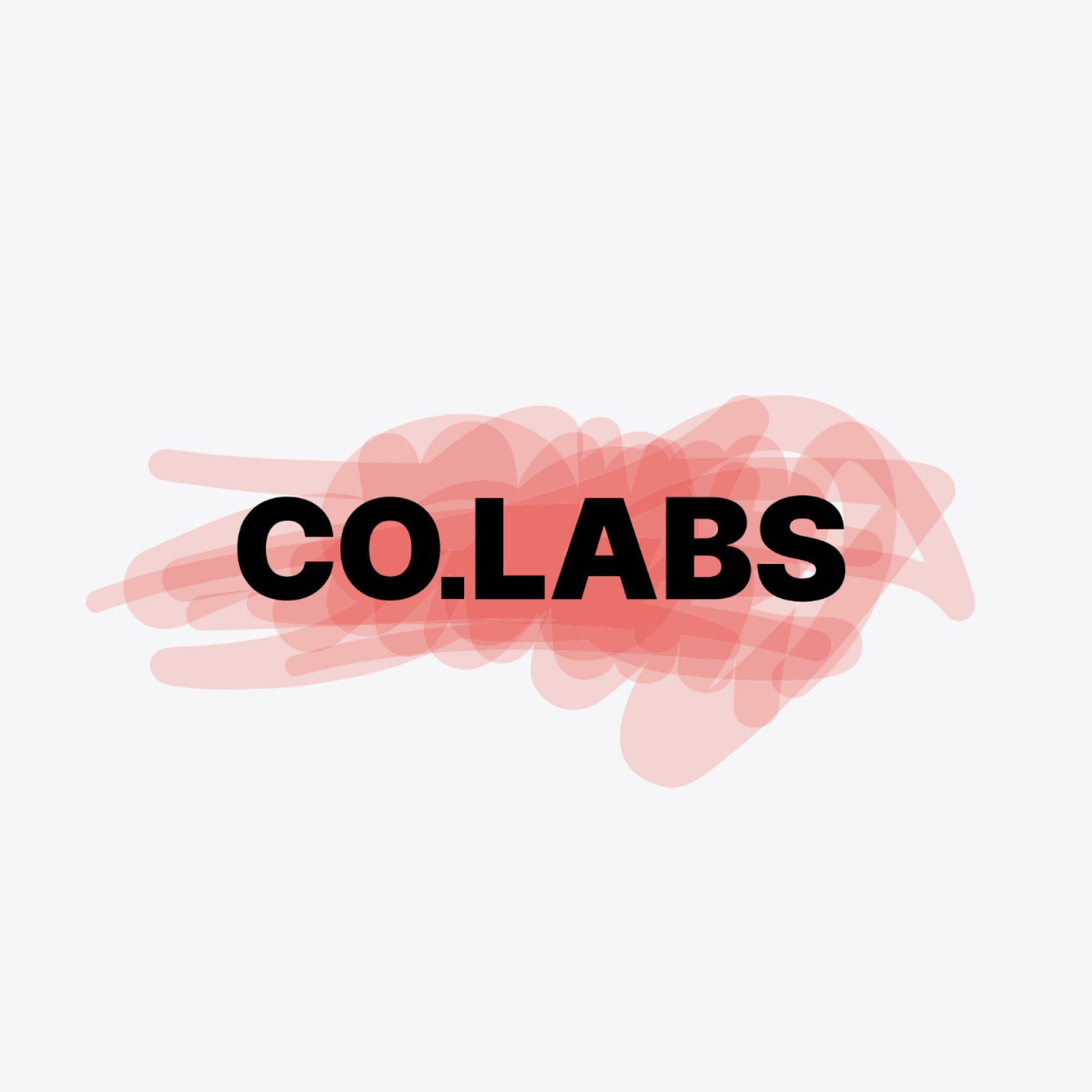
CO.LABS - A Brand that gives structure to expression

.webp)
AI background

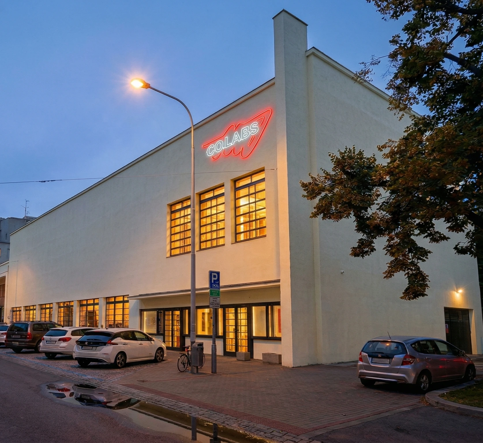
CO.LABS is a community space for independent performing arts.
The brief asked for a brand identity that is bold, outspoken, energetic, unconventional, daring, open‑minded, and contemporary. The challenge was to capture that vivid, performative energy without reducing it to pure expression but turn it into an identity system that could remain flexible yet practical across every touchpoint.
I was the only designer on the project. I designer fluid brand language built around motion, identity, and expression. The result is a brand that stays distinctive even when the logo is not the hero. This project shows how I combine strategy and artistry i my work.
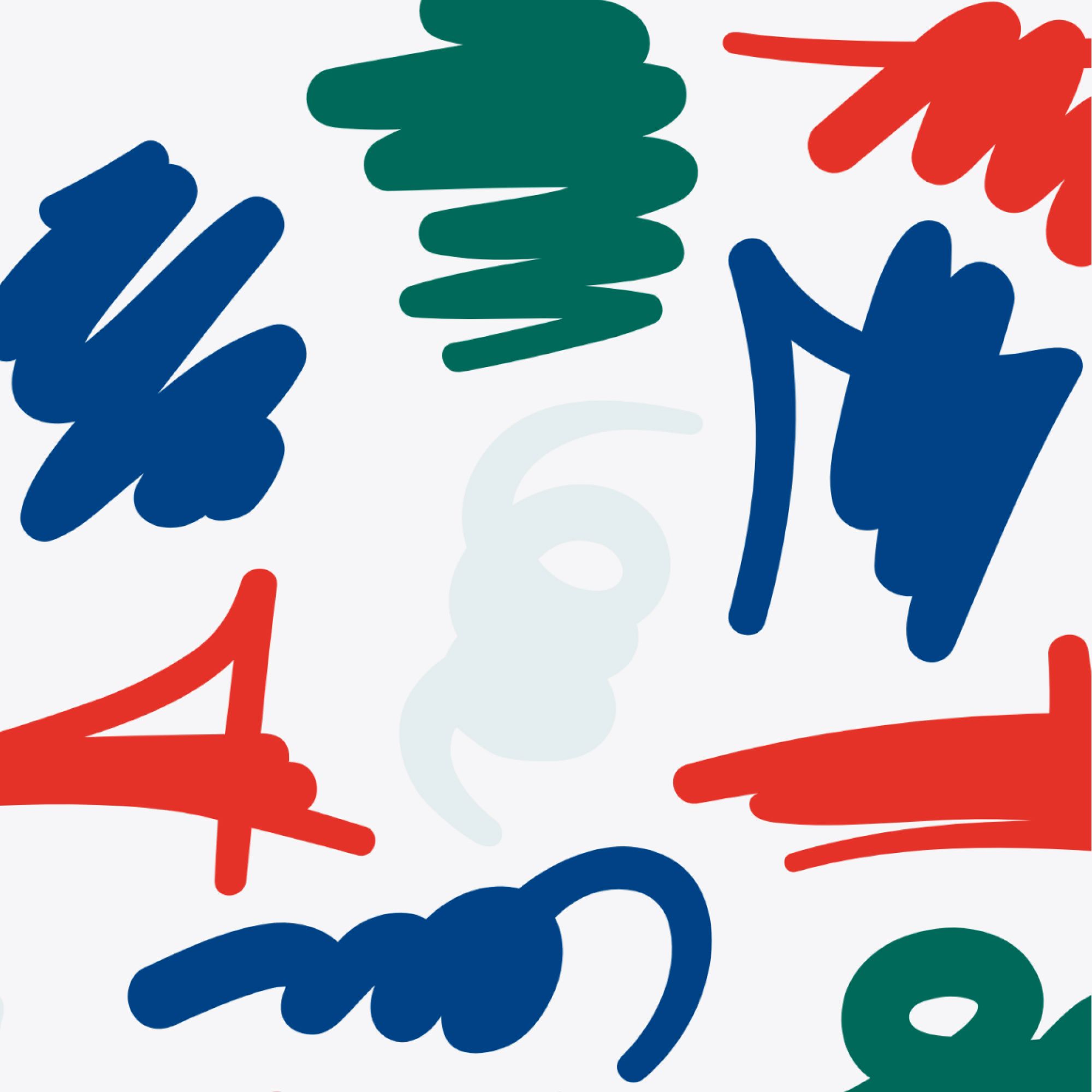
Performing arts are expressive, and constantly in motion. So the identity should behave the same way. Instead of treating branding as a fixed symbol, I treated it as a living system: stable where it needs to be, fluid where it creates meaning.
.gif)
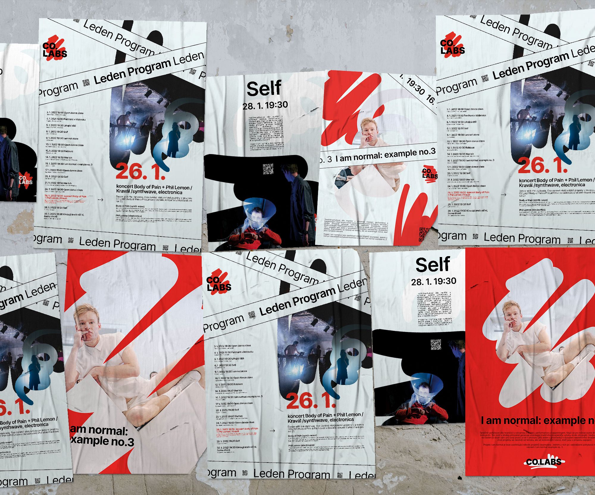
Liquid language
A dynamic element became the foundation of the identity, creating a flexible platform for expression and enables future identity steering.
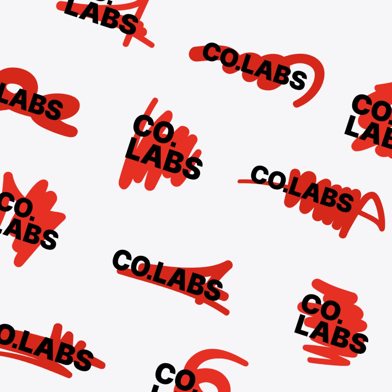
Consistent where needed
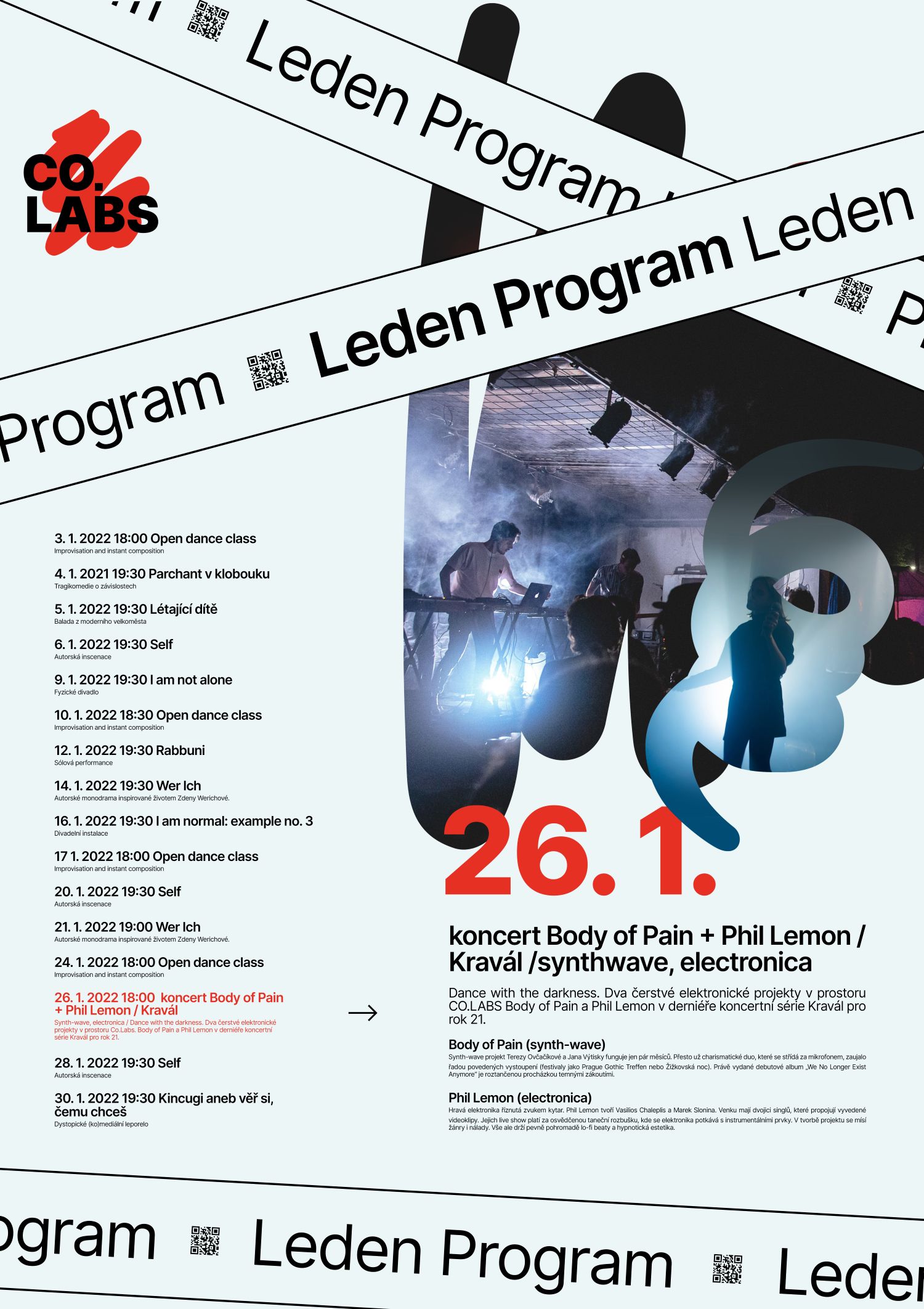
It is designed to stretch across different applications, acting as a unifying mark that brings consistency to every touchpoint.
Representative
At the same time, it carries the performative energy of dance and the gestures of painting, turning movement itself into a recognisable brand language.
Application of liquid identity
An arts platform needs an identity that doesnt constrain but creates space for expression.

.png)
Maverick
Enterpretor
Networker
This concept was not selected as the final brand, yet it remains an important one for my practice. It taught me how to communicate the intention and meaning behind the work with greater clarity. I continue to present it because it captures a core part of how I think: strategy and meaning move together, shaping solutions that go far beyond the visual aspect.